Company Overview

01
Our hero mark. Use it first, use it most.
The gradient wordmark is the face of HeyMax — it carries the brand wherever the brand should shine. Websites, campaigns, decks, social, partnerships: this is your default. Use the dark version on light backgrounds and the light version on brand purple, and always give it room to breathe.
Use for: websites · marketing & ads · presentations · social · anywhere public-facing
Flat

White

Gradients get muddy when they're small, and they don't survive one-colour printing. That's what the flat logo is for: small sizes, limited-colour reproduction (embroidery, engraving, single-colour print), and busy backgrounds where a solid mark reads clearer. It's a fallback, not a preference — if the gradient works, use the gradient.
Use for: small sizes · one-colour print · embroidery & engraving · busy backgrounds
Logo and tagline

"Travel Sooner, Better, Smarter" pairs with the wordmark in fixed arrangements — stacked or side-by-side. Use the lockup where the brand is introducing itself: covers, hero banners, splash moments. Never rearrange the pieces or set the tagline in your own type.
M alone

Restricted — merch and in-app motion only.
Body: The M on its own is a brand accent, not a logo. It works where HeyMax is already established: on merch you're wearing, or in motion inside the app — loading states, transitions, moments of delight. Everywhere else it needs the full name to do its job, so never use it in marketing, documents, or anywhere it would stand in for the wordmark.
Use for: merch (tees, caps, stickers, totes) · in-app animation
Never: marketing · as a wordmark replacement
Monogram

Restricted — our most compact mark, for the tightest spaces.
Body: The M in the pill is HeyMax at its smallest. Reach for it when the wordmark physically won't fit or shouldn't dominate: name cards, small merch details like pins and embroidery, and watermarks on photos, documents, and video. It never replaces the main logo, and it isn't the app icon — that has its own artwork.
Use for: name cards & small print · merch details · watermarks
Never: as the main logo · as the app icon
Favicon and App Icons

Product only. Never in marketing.
Body: The favicon (the Bracket M) and the app-icon tiles are built for one context: product surfaces. Browser tabs, app stores, home screens, push notifications. They're engineered for tiny sizes and never appear in marketing materials, decks, or print.
Small sizes only — these are product assets, never marketing assets.
Max Miles


Currency only. Never a brand logo.
Body: The Max Miles mark identifies the currency — a sub-product of HeyMax, not a brand of its own. Use the full lockup when naming Max Miles, and the M symbol next to numbers, like a dollar sign: balances, conversion rates, earn-and-redeem messages. It always lives under the HeyMax brand.
No number, no product mention — no mark.
RULES


Don't alter the weight contrast — "Hey" stays light, "Max" stays bold. Never even them out or reverse them.
Don't recolour the wordmark or add colours to split it; use only the approved dark, light, and gradient versions.
Don't stretch, condense, skew, or rotate the logo or monogram.
Don't swap the typeface or retype it — always use the supplied artwork.
Don't add effects: no shadows, outlines, glows, or strokes.
Don't crowd it — respect the clear space and never place elements inside the safe zone.
Don't shrink it below its minimum size (use the small/favicon versions instead).
Don't rearrange the lockup — keep the wordmark, monogram, and "Travel Sooner, Better, Smarter" tagline in their defined relationships.
Don't place the logo on low-contrast or busy backgrounds; use the dark version on light, light on dark.
Don't distort or recolour the monogram "M" or use it in place of the full logo where the wordmark is required.
Which logo do I use?
Public-facing anything → Gradient logo
Small, one-colour, or busy background → Flat logo
Merch or in-app animation → M alone
Name card, watermark, tiny space → Monogram
Still unsure? → Gradient logo, or ask the design team
Main rules
Don't use the M or the monogram where the full wordmark is expected, they're approved for merch, in-app motion,
name cards, and watermarks only.Don't use the app icon or favicon in marketing,
product surfaces only.
Logo package
Figma files and detailed guidelines
Figma Logo Guideline
Logo Picker
Logo / Icons repo
Github
Logo package
png-svg / RGB-CMYK
Download ZIP
5.1
Brand colours
Purple is the heart of HeyMax confident, premium, and distinct.
Dark and White carry structure, contrast, and legibility. A tight, disciplined palette keeps the brand instantly recognisable everywhere it appears.
5.2
Gradients in use
Gradients are campaign atmospheres for posters, social stories, menu specials, and seasonal drinks. Keep the logo white and allow generous negative space.



Background generator
Background generator
Github Link
Do
Use Brand Purple for type and buttons. It's our voice, not our wallpaper.
Use gradient backgrounds — soft, light, built from the brand families.
Follow the product. The app sets the standard for every surface.
Let content sit on light, airy gradients. Purple does the talking on top.
Don't
Don't flood backgrounds with solid Brand Purple.
Don't use solid colour fills as backgrounds — gradients only.
Don't invert the system: purple background, white type is not our look.
Don't create gradients outside the approved set.
Colour Guidelines
Figma files and detailed guidelines
Figma Colour Guidelines
PRIMARY TYPE / Plus Jakarta
Plus Jakarta
Google font
Google font download link
Google Font
RULES
Use display type for drink names, posters, and menu moments that should feel warm and appetising.
Do not mix in extra decorative fonts; the logo already carries the handmade character.
Typography should make menus easy to scan, prices easy to compare, and the Drip voice recognisable at counter distance.
TYPE SCALE
Display / Hero — 64px / 500 / 1.10 / normal — Plus Jakarta Sans Bold
Section Heading
Section Heading — 52px / 500 / 1.20 / normal — Plus Jakarta Sans Medium
Sub-heading Large — 36px / 500 / 1.30 / normal — Plus Jakarta Sans Bold
Sub-heading
Sub-heading — 32px / 500 / 1.10 / normal — Plus Jakarta Sans Medium
Sub-heading Small
Sub-heading Small — 25px / 500 / 1.20 / normal — Plus Jakarta Sans Bold
Feature Title
Feature Title — 20.8px / 500 / 1.20 / normal — Plus Jakarta Sans Medium
Editorial body text for long-form prose
and rich content passages.
Body Serif — 17px / 400 / 1.60 / normal — Plus Jakarta Sans Regular
Font Guideline
Figma guideline and tokens
Link to Figma

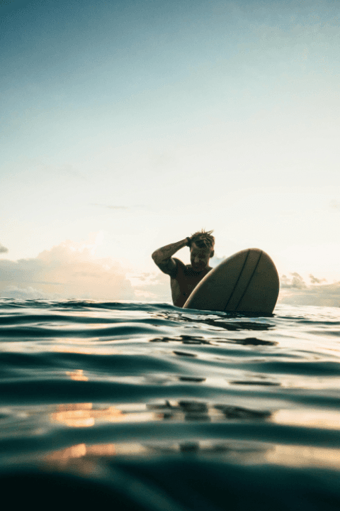
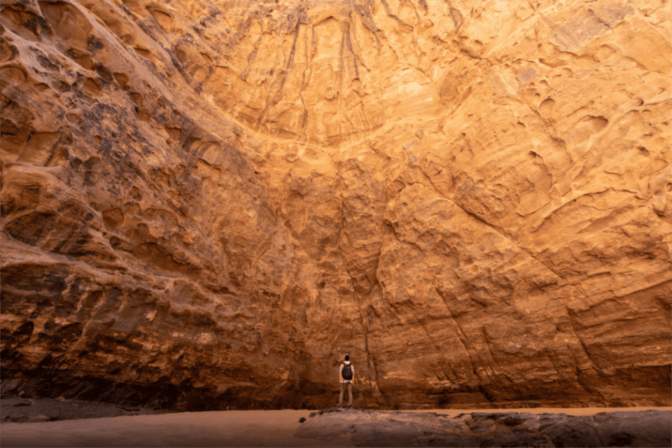
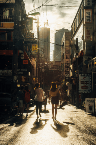
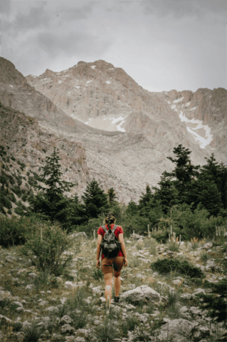


Photo Bank
Currated photo stocks to use
Link to Air













Illustration Bank
Currated illustrations stocks to use
Link to Gdrive
Motion Bank
End frames and animations
Link to Gdrive
Logo animation
Logos with backgoruns and alpha chanels
Link to Gdrive


Figma file
Figma library of screens and products
Link to Figma
Images export
Curated product shots
Link to Gdrive

Printed ad, warm visuals clear headline
Product shots

Social media banner

Social media banner
Social media banner
Figma templates
Currated working files
Figma working files
9
Resources
Final asset packages for café teams, printers, and digital partners.
Logo package
png-svg / RGB-CMYK
Google Drive
Motion logo
mov, gradient, alpha, vertical, horizontal
google drive
Motion Product CTA
mov, gradient, alpha, vertical, horizontal
google drive
Banners working files
Figma files
Link to Figma
Images
Image bank
Link to Air
Motion
drip-logo-master — ZIP / SVG / PNG
Google Drive